Another 101 type reference post, which I hope is also useful for seasoned indie consultants, on basic consulting diagrams. The kind that you should be able to instinctively judge as appropriate to a discussion, and rapidly whiteboard without thinking too hard. I’ve picked 16 of my favorites to get you started, but you should develop your own vocabulary.
Recent chats with some friends have made me realize that my approach to consulting is based on what academics call ethnomethodology, and this particularly applies to how I use diagrams in conversations.
Loosely, ethnomethodology means taking the modes of thought and problem solving of “lay” people seriously, and in my case, actually making them my own.
A great deal of business thinking runs on diagrams drawn on whiteboards, or inserted into presentations/briefings. There is a reason actual working people doing serious work rely on these diagrams to frame and structure conversations.
You’re not a good consultant until you understand the logic and appeal of every major popular diagram type, and learn to use each tastefully, with good “form”.
A word on the relationship between diagramming approaches and indie consulting brands.
Many beginning consultants have a weird kind of insecurity that leads them to invent and rely on over-complicated, bespoke constructs that they can name after themselves. While these can sometimes be useful, especially ones that are developed and refined over many years, across hundreds of applications, such as Wardley maps, in general, they are fragile visual bullshit. You’re much better off learning to use the basic commodity diagrams well than trying to make up and sell your own in most cases.
Many consultants also seem to take a weird kind of pride in avoiding the basic tools of the consulting trade like 2×2 diagrams, almost as though they are afraid they won’t be taken seriously if they use such familiar constructs. To me, this is a clear tell that you don’t have confidence in your basic thinking, and so are wary of commodity packaging.
That or you’re exhibiting a kind of snobbery towards vernacular visual business language that will lead to people distrusting you and refusing to think with you.
Of course, a few people genuinely have objections to one or other diagramming approach as representing dangerously sloppy thinking (Simon Wardley and I have a long-running good-natured beef about 2x2s for example, but he’s also the creator of one of the best 2x2s I’ve seen: openness versus level of strategic play).
Basic diagrams are basic for a reason. They’re like free weights in the consulting gym. Sure they can be used in cringe-inducing ways that are vulnerable to parody, but used with good form, they blow complicated name-brand machine weights and fancy equipment out of the water. So whatever the kind of consulting you do, it pays to master basic consulting diagrams.
What is common to all of these is that you do not need external data or measurements, or generally, even a brainstorm. These are ways to capture your existing situation awareness of what’s going on, and structure the conversation in a way that participants can pool their beliefs, with the right dominant mood (conflict, cooperation, analysis, synthesis).
All 16 of these diagrams also have a very special and useful feature: they can usually be described with 5-9 chunks of information. This fits Miller’s famous Magic Number argument that we can hold 7±2 in short-term memory. This means good discussions tend to stay in that range and avoid the meeting getting stupid.
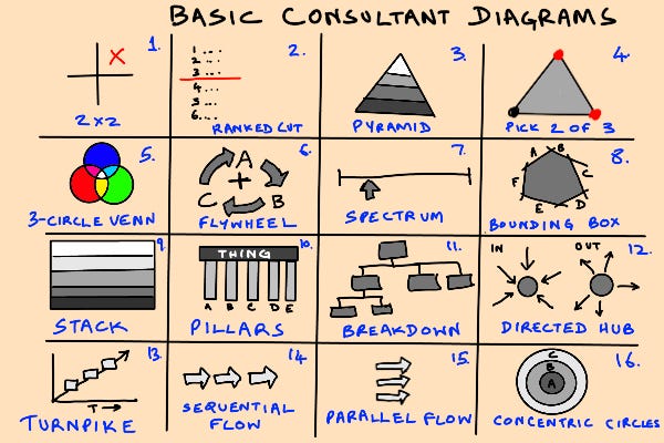
So without further ado, let’s take a quick tour of the 16 basic diagrams.
1. The 2×2
The 2×2 is the barbell squat in the business gym. Basic, dull, but a full-brain workout that forces you to think, pay attention, and practice good form to avoid injury. It can be used to break out of a zero-sum situation by adding a dimension, relate archetypal cases, etc. One of its most interesting and unexpected uses is as a conflict de-escalation tool. When 2 people are arguing about mutually exclusive options, or a single spectrum, moving the conversation to a non-conflict mode (if that’s what you want to do) can be as simple as adding an axis that makes the unspoken conflict variable explicit. The 2×2 is also a natural sweet spot, so resist the temptation to go 3×3 or 2x2x2. It almost never works. Get good at the 2×2.
Miller Complexity: 11 (2 axis labels, 4 limit labels, 4 quadrant labels, 1 title)
Examples: The BCG Growth Share matrix, Johari window.
2. The Ranked Cut
If the 2×2 is the squat, the ranked cut is the deadlift. A simple list is just a data capture structure, but what makes the ranked cut a proper diagram is the addition of a single line, to model a cut-off or threshold. Usually you get to a ranked cut by brainstorming a list, ranking it in some priority order, and then having a discussion about where to draw the line and why (which can lead to revision in the prioritization logic). The line usually marks a proposal dividing different regimes of action (in the simplest case, do versus don’t).
Miller Complexity: 4 (above the line, below the line, meaning of the line, ranking criterion)
Examples: Feature prioritization, candidates shortlisting.
3. The Pyramid
The pyramid is used to illustrate a leverage hierarchy of some sort. It is perhaps the most familiar diagraming technique and is synonymous with organizations themselves. The basic use of the pyramid is to create a hierarchical structural scaffolding to identify levels of abstraction in analysis, description, and prescription. It’s a blank map template for anything. I of course, love pyramids. My entire consulting career is based on an essay about one: Hugh MacLeod’s sociopaths/clueless/losers cartoon.
Miller Complexity: 3-7
Examples: Capability Maturity Model, Maslow’s pyramid, MacLeod hierarchy.
4. The Pick-2-of-3 Triangle
The pick-2-of-3 is probably my own favorite after the 2×2, but is not very commonly used, and this is primarily because it is among the most difficult to use. It requires thinking about interacting real-world constraints that model real tradeoffs. It is an excellent tool to use when people seem to be forgetting constraints that matter and are going wild with too-sloppy brainstorming. As with 2x2s, there seems to be a natural limit, and a sweet-spot value to the 2-of-3 case, and attempts to create n-of-m discussions generally don’t work, so don’t go nuts trying. The combinatorics just get too out of hand and exit the Miller 7 +/- 2 zone fast.
Miller Complexity: 3-6. Three basic constraint variables, three pairwise-active regimes.
Examples: The original pizza triangle, the Mundell-Fleming trilemma, the CAP theorem.
5. The 3-Circle Venn Diagram
The Venn diagram is a way to create an interference pattern, and add resolution to a basic structure by creating a set of fill-in-the-blank complexities. The 3-circle Venn diagram is the most common one for a good reason: all possible intersections create zones. When you get up to 4, you can’t intersect opposite pairs pairwise visually. It is particularly useful for archetype analysis, where traits intersect in interesting ways that create evocative role descriptions, like the famous nerds/geeks/dweebs/dorks Venn diagram.
Miller Complexity: 10 (7 mutually exhaustive regions, plus 3 basic circle labels)
Examples: Nerds/geeks diagram, data scientists, Drew Conway data science diagram.
6. The Flywheel
The flywheel is a visualization of a system that creates compounding effects via a positive feedback loop or virtuous cycle. It is a diagram that is powerful in inverse proportion to the number of blocks in the positive-feedback circle. A 2-block flywheel is more powerful than a 3-block flywheel. Negative feedback flywheels are also useful to visualize draining momentum/vicious cycles.
Miller Complexity: 2-7 (one per block in the circle)
Examples: Customer acquisition loops, Amazon flywheel.
7. The Spectrum
The spectrum is probably the single most commonly used business diagram, but is easily my least favorite, because it tends to suck people into a no-exit, zero-sum frame. Often, people use sets of spectra to characterize a large decision space, or flesh out the feature space of a product category. This is a slightly better way to use spectra. Spectra can be binary or continuous, and the resulting “product spaces” of spectra sets can be mixed discrete/continuous.
The spectrum is probably more useful in discussions about design problems than analysis problems.
Miller complexity: 3 per spectrum (end points, pointer position)
Examples: feature set descriptions for disruption debates, persona models.
8. The Bounding Box
The bounding box is one of my favorites, and I rarely see non-engineers use it. It is a loose, qualitative generalization of the idea of a “design” space illustrating the zone where you have freedom of choice. Each edge — and I recommend drawing this as an irregular polygon — represents one boundary with an adjacent zone that can affect what you do, but is outside your control. These could be supply chain partners, etc. For example, in the semiconductor industry, if you are a chip design outfit, you might have a bounding box with foundry, device manufacturers, and IP partners as your edges.
Miller Complexity: 4—9 (3-8 labeled boundary edges, with an interior label for your in-scope design space.
Examples: Any sort of supply chain discussion, discussion of physics constraints.
9. The Stack
The stack is another diagram inherited from engineering, with the archetype being the stack diagram of a computer. It looks a bit like the pyramid, but has equal size layers. It is great to use for discussing actual stacks involved in engineering, design, and architecture discussions, as well as more abstract things like industry sector structure, and market structure.
Miller Complexity: 3-7 (I’ve rarely seen stack diagrams with more than 7 layers)
Examples: Industry structure diagrams, software architectures.
10. The Pillars
The pillars are, to me, one of the most interesting diagram types because I almost never use them. Their sweet spot is values-based reasoning. This does not necessarily mean ethics at a human level. It can be a dogma for highly opinionated engineering design. The vertical orientation suggests a cutting-through of a stack or pyramid, and each pillar suggests a “present at every level of abstraction” concept. So pillars necessarily have to be somewhat abstract, because they’ll be embodied differently at different levels. With 3-pillar diagrams, you can also discuss stability questions, since a 2-legged stool will fall over.
Miller Complexity: 3-6 (more than 6 pillars and you have a caterpillar)
Examples: “Core values” diagrams, equilibrium diagrams.
11. The Breakdown
The breakdown is a special kind of top-down tree, where a large ambiguous thing is progressively broken down into component parts that are bite-sized chunks ready for resource allocation, responsibility assignment, or functional coverage in a design. They can be used in formal, technical ways in some engineering disciplines, but are commonly used in much more informal ways.
Miller complexity: 9-15, but with some chunking by branch and level lowering the cognitive burden to single digits.
Example: project breakdown, root cause analysis, org charts.
12. The Directed Spokes
The directed spokes are a set of arrows arranged along the spokes of an imaginary wheel, with a labeled hub. In an inward pointing orientation, they usually represent environmental forces you must respond to. In the less common outward orientation, they represent some sort of impact analysis. Where a flow (see 14 and 15) is a controlled, directed pattern of unfolding action and consequences, the outward spokes are good for thinking about relatively uncontrolled impact patterns, such as thinking about the effects of a major press release.
Miller Complexity: 4-5 (1 per spoke, 1 central concept)
Examples: Descriptions of environmental factors affecting a company, convergence/divergence in trends, impact analysis, fallout patterns.
13. The Turnpike
The turnpike is an idealized pattern of growth where two evolving variables are in a healthy dynamic balance. In the simplest, somewhat degenerate case, the x-axis is simply time, while the y-axis is something like capability. The turnpike — the term is from economics — is the vector of optimal growth. Below the line and above the line you get some sort of suboptimal (and possible unstable) out-of-balance condition. On the turnpike, you get some sort of idealized pattern of evolution or growth.
Miller Complexity: 7-9 (1 per axis, turnpike label, above/below line region labels, 1 per “milestone” box)
Examples: Product development roadmaps, capability maturation path, business evolution stages.
14. The Sequential Flow
The sequential flow is simply a single set of arrows going from left to right, representing the temporal gestalt. The more detailed (and in most cases, less useful and possibly harmful) version is the Gantt chart. The sequential flow serializes the necessarily complex detailed behavior into a set of phases or gears. Often separated by stage gates with go/no-go decision points, in which case this is the horizontal, temporal version of the ranked cut.
Miller complexity: 3-8 (a per arrow, and optionally, one between each pair of arrows, and a pair of bookends, along with a overall flow label)
Examples: Project phase structure, narrative structure, causal hypotheses.
15. The Parallel Flow
Parallel flow diagrams are useful when you need to talk about synchronized efforts. Unlike the vertically oriented cousin (Pillars) which represent timeless values, the parallel flow represents the most precisely timed artifact in business: the synchronization point. Things that have to line up at a single point in time.
Usually it is used to talk about an all-or-nothing outcome with several necessary conditions (a large AND gate basically), but with some practice, you can also use it easily for talking about hedged option sets (an OR gate).
Miller complexity: 3-8 (a per arrow, synchronization point label, overall flow label)
Examples: Launch conditions modeling, go/no-go necessary/sufficient conditions.
16. The Concentric Circles
The last of my 16 basic diagrams is a focusing tool. Concentric circles are usually used to think about fuzzy structural boundaries, with a stepped transition from inside to outside. A common example is modeling an ecosystem, or a set of prioritized concerns with a coarse partial ordering. Interestingly, the concentric circles are closely related to the basic linear spectrum. The radial axis of a concentric circles diagram is a directed spectrum. The tangential direction represents a sort of unsorted residual direction of “everything else”.
Miller Complexity: 3-5 (one per ring)
Examples: Ecosystem models, partitioning of concerns along a focal to peripheral spectrum.
Using Visual Language
There are plenty more, but I’ll stop at 16. If you have any favorites that aren’t on my list, do comment. I might eventually make a flashcard deck of these.
Diagrams are like any other language. You get better with practice, and your vocabulary expands expands as you gain both experience and theoretical knowledge. So long as you never use diagrams simply for the sake of using them, and focus on improving your ability to pattern match contexts where a particular type of diagram is useful, your command of the language will improve, and you will become more eloquent and useful as a discussion partner.
Don’t turn your nose up at the basic stuff. Don’t invent or use unnecessary, bespoke, complex stuff. Use what works, pay attention when and how it works, and use it better next time. If people you’re talking to seem to have an aversion to particular bits of your vocabulary, don’t waste too much time trying to convince them. Just switch to mutually preferred vocabulary. The point is the discussion, not displaying your diagramming prowess. It’s not complicated unless you want to make it complicated.